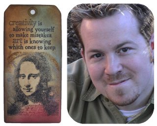
In the world of scrapbooking, Tim Holtz stands out from the crowd. Not only is he the most well known man working in a field dominated by women but he's an all round nice guy too. Corner Tim for a few minutes and you'll find he's full of enthusiasm for the craft and loves sharing his knowledge.
Tim is best known for his signature range of 24 Distress Inks which vary from sepia toned browns and dusky pinks, blues and greens to the newer brights with fun names like Spiced Marmalade, Brushed Corduroy and Broken China. As Tim says, "it's not just about brown anymore". When pressed, Tim admitted his favourite name in the new colour range is Shabby Shutters but he adds that Worn Lipstick reminds him of grandmother's lips when she kisses you and it leaves a lipstick mark on your cheek.
To go with the original line of Distress Inks, Tim and the crew at Ranger have developed a line of Distress Embossing Powders. I asked Tim if he had any tips or techniques to share when using thest powders, not unexpectedly, he did!
Tim points out that Distress Powders are different to regular embossing powders in that they melt to a matte finish rather than the usual gloss finish. They have a rough texture when they’re embossed and the release crystals that they contain cause parts of the embossed area to “rub off” when cool to give a distressed result.
To emboss in colour, Tim suggests you apply Distress Ink or Embossing Ink to your stamp and stamp the image. Shake the Distress Powder in the jar and apply the powder over the stamped image. Remove excess powder and return it to the jar. Heat the embossed image with a heat gun – the colour of the powder will change and it will feel like sandpaper when cool.
To distress the image, wait until the embossed image is completely cool then gently rub it with your hand to remove the release crystals. Discard the release crystals and, for an even more distressed look, Tim says “scrape away more of the powder”.
To distress your project even more, apply Distress Inks to a Cut n’ Dry Foam piece and rub the inked foam in a circular motion beginning over the edge of the image and pull the ink onto the paper to fill the inside of the image. You can also use Cut n’ Dry Foam to ink the edges of the paper – work from light to dark colours to make image “pop”.
Labels: distress embossing powders, distress inks, Tim Holtz
 I love working in wire – it’s such a fun medium. I have a cool technique for twisting wire into a bicycle shape which I use every now and then. Here is one incantation of the design on a Bon Voyage card which featured in Get Creative magazine in Australia.
  The full instructions are here including details on twisting some wire into your own bicycle.


